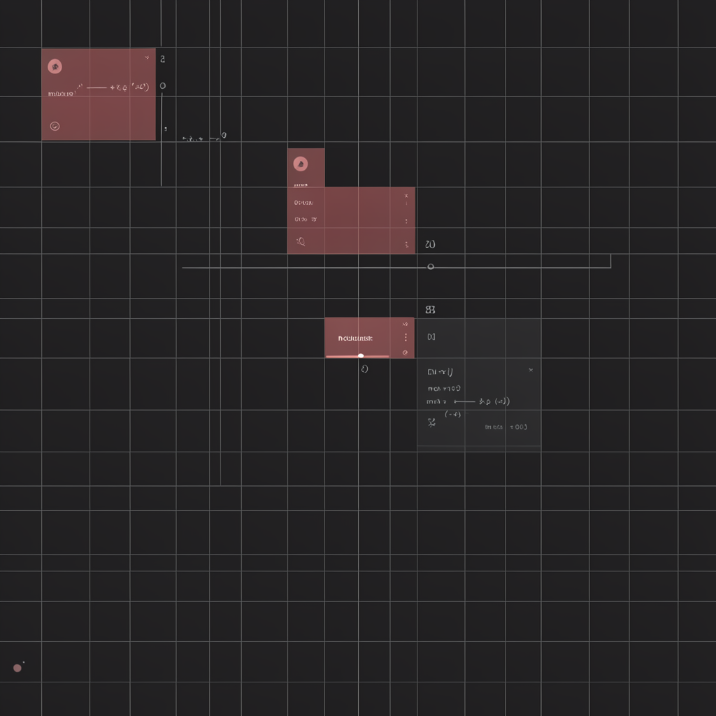
Of all the judgments a design agent must make — color harmony, typographic rhythm, visual weight, composition — only one can be verified with absolute binary certainty. An AI agent can look at a computed pixel value and ask one question: is it divisible by 8?
If the answer is yes, the spacing conforms to the 8-point grid. If no, it doesn’t. No taste. No training data drift. No latent space interpolation. Just arithmetic. This makes the 8-point grid the ideal proving ground for agent-driven design quality assessment — a concrete, deterministic criterion in a field otherwise dominated by subjective aesthetic signals.
What the 8-Point Grid Actually Is
The 8-point grid is a spacing convention that constrains all padding, margin, gap, and positioning values to integer multiples of 8 pixels. Every empty space between elements must land on a grid line spaced 8px apart. Google’s Material Design formalized this approach in 2014 as part of its responsive layout grid, stipulating that “spacing between elements and spacing around elements follow an 8dp square grid” [1]. The Material 3 spec doubles down: spacing values of 4, 8, 12, 16, 24, 32, 40, and 48 dp form the canonical scale [2].
This is not an aesthetic preference. It is a mathematical constraint applied to a visual medium. The grid precedes any decisions about color, type, or content. It is infrastructure, not ornament.
The list of major design systems that adopted the convention reads like a roll call of the last decade’s most influential UI frameworks: IBM Carbon System uses an 8px baseline with a 2px sub-unit for borders and dividers [5]; Shopify Polaris defines spacing tokens in 4px increments with 8px as the functional minimum; Tailwind CSS ships space-x-* and p-* utilities that all resolve to multiples of 4 or 8. None of these systems claim aesthetic superiority. They claim reliability — predictable rhythm, consistent density, fewer layout bugs.
The Mathematics of 8
Why 8 and not 10 or 12? The answer is a convergence of divisibility, device density, and display geometry.
Eight is divisible by 1, 2, and 4 — meaning a single 8px base unit can produce halves (4px), quarters (2px), and doubles (16px) without fractions. This matters because UI layout needs fine-grained control at small scales (typography baselines, icon spacing) while maintaining consistent ratios at large scales (section margins, page gutters). A 12px grid, by comparison, cannot halve cleanly to 6px without breaking the integer constraint that makes the system computable [4].
Device pixel density adds a second constraint. Retina displays at 2x and 3x scaling must map design points to physical pixels without anti-aliasing or sub-pixel rendering. An 8px design unit maps to 16 physical pixels at 2x (exact) and 24 physical pixels at 3x (exact). A 10px unit maps to 20 and 30 — both exact, but the half-unit (5px design = 15px physical at 3x) isn’t [3]. The 8px grid ensures that every sub-unit maintains clean pixel alignment across all major density tiers.
Screen widths reinforce the choice. Common viewport widths — 320px (iPhone SE), 375px (iPhone), 768px (iPad), 1024px, 1440px, 1920px — are all evenly divisible by 8. A 12-column grid at 8px gutter spacing produces identical column counts across every major breakpoint without orphan pixels at the edges [6].
Design Tokens as the Agent Interface
Design tokens transform the 8-point grid from a convention into a machine-readable specification. Instead of hardcoding padding: 24px, a design system defines space-300: 24px, space-200: 16px, space-100: 8px, and so on [7]. The token abstracts the raw value behind a semantic name, but the underlying arithmetic constraint remains.
For an AI agent, tokens are an ideal interface. A token dictionary is a finite, enumerable set of key-value pairs. An agent can load the scale, compute the range, and verify that every value in the set satisfies value % 8 == 0 — or, for systems that also support the 4px sub-unit (Material 3, Carbon), value % 4 == 0 with an awareness of which values serve layout vs. typography [2][5]. The IBM Carbon token scale, for example, defines 22 named spacing tokens from 2px up to 160px. Every token documents its intended use: $spacing-03 (8px) for “padding between elements in a list,” $spacing-05 (24px) for “card padding” [5].
An agent doesn’t need to understand why a card needs 24px padding. It only needs to verify that the padding is 24px and that 24 % 8 == 0.
What an Agent Can Verify — and How
A spacing auditor agent operates in four steps: extract, parse, validate, report. Here is the core validation logic in pseudocode:
def audit_spacing(doc, grid_unit=8):
    spacing_props = [
        'margin', 'padding', 'gap',
        'margin-top', 'margin-right', 'margin-bottom', 'margin-left',
        'padding-top', 'padding-right', 'padding-bottom', 'padding-left',
        'column-gap', 'row-gap', 'width', 'height'
    ]
    violations = []
    total_checks = 0

    for element in doc.query_selector_all('*'):
        styles = get_computed_styles(element)
        for prop in spacing_props:
            value = parse_px(styles[prop])
            if value is None:
                continue
            total_checks += 1
            if value % grid_unit != 0:
                violations.append({
                    'element': element.tag_name,
                    'class': element.class_name,
                    'property': prop,
                    'value': value,
                    'nearest_valid': round(value / grid_unit) * grid_unit
                })

    score = (total_checks - len(violations)) / total_checks
    return {'score': round(score, 3), 'violations': violations}
This is trivially implementable — a browser extension, a Playwright script, a Puppeteer audit, or a headless Chrome agent can extract window.getComputedStyle() for every element in the DOM and run this validation in under 500ms for a typical page. The results are immediately actionable: “Element .card-header has padding-bottom: 13px; nearest valid value is 16px.”
No design judgment required. Just a modulus operation.
The 4px Sub-Unit: Reconciling Layout and Typography
The clean constraints of the 8-point grid break down at the typography level. Text baselines, line-height, and icon alignment frequently require 4px increments — half the base unit. A common pattern is line-height: 20px on font-size: 14px body text, producing a 4px offset from the grid when the baseline is calculated. This tension between layout spacing (8px) and vertical rhythm (4px) has driven a partial migration toward the 4-point grid in recent years [8].
Material 3 and Carbon both acknowledge this by defining a dual scale: 8px increments for horizontal and large-scale layout spacing (margins, page padding, card gaps), 4px increments for vertical rhythm and fine detail (typography baseline offsets, icon positioning, divider thickness) [2][5]. Tailwind’s default spacing scale is 4px-based from 0 to 64px, then switches to 8px increments above that. The reconciliation is pragmatic: use 4px as the atomic unit, but design decisions at the layout level should default to 8px or its multiples to maintain visual density and alignment with screen dimensions [9].
For an agent, this means the validation ruleset must be context-aware. A padding of 4px is valid for an inline badge inside a text block but likely invalid for a card container. The agent needs a semantic taxonomy — which elements belong to the “layout” category (8px constraint) versus the “typography” category (4px constraint). Design tokens provide this taxonomy through naming: Carbon’s $spacing-02 (4px) is explicitly labeled for “icon and text spacing inside a component” while $spacing-04 (16px) is for “component-to-component spacing” [5].
Implications for Agent-Driven Design
The 8-point grid matters to AI design agents for a reason that goes beyond spacing: it proves that some design criteria can be formalized. If spacing is reducible to value % 8 == 0, then other design properties — contrast ratios (WCAG AA/AAA), color distances (CIEDE2000), typographic scales (modular scale ratios), layout proportions (golden ratio, thirds) — are also candidates for automated verification.
An agent equipped with a spacing linter can:
- Audit an existing design system for grid compliance in real time.
- Auto-correct violations by snapping values to the nearest grid point.
- Enforce consistency across a team’s output without code review overhead.
- Generate spacing scales optimized for a given set of constraints (viewport range, density targets).
The 8-point grid is not the end goal. It is the first checkmark on a list of deterministic design criteria that AI agents can own. Every modulus test passed is one less judgment call left to taste, and one more signal that design — at least the parts of it that run on arithmetic — can be taught to machines.
Sources
[1] Google Material Design 2 — Spacing Methods: https://m2.material.io/design/layout/spacing-methods.html
[2] Google Material Design 3 — Spacing: https://m3.material.io/styles/spacing
[3] Intro to the 8-Point Grid System — Built to Adapt: https://medium.com/built-to-adapt/intro-to-the-8-point-grid-system-d2573cde8632
[4] Everything You Should Know About 8-Point Grid System — UX Planet: https://uxplanet.org/everything-you-should-know-about-8-point-grid-system-in-ux-design-b69cb945b18d
[5] IBM Carbon Design System — Spacing Overview: https://carbondesignsystem.com/elements/spacing/overview/
[6] 8px Grid Spacing System Explained — The Hangline: https://www.thehangline.com/8px-grid-spacing-system-explained-for-web-designers/
[7] Spacing Scales Explained — Alltools.dev: https://alltools.dev/reference/design/spacing-scales-explained/
[8] Goodbye 8-Point Grid, Hello 4-Point Grid — UX Design: https://uxdesign.cc/goodbye-8-point-grid-hello-4-point-grid-1aa7f2159051
[9] 8-Point Grid and Typography on the Web — freeCodeCamp: https://www.freecodecamp.org/news/8-point-grid-typography-on-the-web-be5dc97db6bc/